var hist = [];
var startUrl = 'index.html';
$(document).ready(function(){
loadPage(startUrl);
});
function loadPage(url) {
$('body').append('
Loading...
');scrollTo(0,0);
if (url == startUrl) {
var element = ' #header ul';
} else {
var element = ' #content';
}
$('#container').load(url + element, function(){
var title = $('h2').html() || 'Hello!';
$('h1').html(title);
$('h2').remove();
$('.leftButton').remove();
hist.unshift({'url':url, 'title':title});
if (hist.length > 1) {
$('#header').append('
'+hist[1].title+'
');$('#header .leftButton').click(function(){
var thisPage = hist.shift();
var previousPage = hist.shift();
loadPage(previousPage.url);
});
}
$('#container a').click(function(e){
var url = e.target.href;
if (url.match(/jonathanstark.com/)) {
e.preventDefault();
loadPage(url);
}
});
$('#progress').remove();
});
}
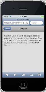
When you run it, it works - there's some text that appears that corresponds to the back button and actually works. Here's what you should see:

However, the "button" really needs to look like a button. That's where the css for the button comes in:
Example 3.11. Add the following to iphone.css to beautify the back button with a border image
#header div.leftButton {
font-weight: bold;
text-align: center;
line-height: 28px;
color: white;
text-shadow: rgba(0,0,0,0.6) 0px -1px 0px;
position: absolute;
top: 7px;
left: 6px;
max-width: 50px;
white-space: nowrap;
overflow: hidden;
text-overflow: ellipsis;
border-width: 0 8px 0 14px;
-webkit-border-image: url(images/back_button.png) 0 8 0 14;
}
I think the line height might be the height of the text, not sure though. The shadow is black with an alpha (transparency) of .6. There's some description of them in the tutorial.
And now you get a nice, iPhone-ish looking back button:

The tutorial has a nice image which shows the undesirable gray box that appears over the back button when you highlight it (trying holding the button down to get a good look at it).
To get rid of that effect, all you have to do is add the following line to the css:
-webkit-tap-highlight-color: rgba(0,0,0,0);
And the effect disappears. Note that I had to start my iOS to have the change take effect - something which has occurred several times.
To get a darker effect when the button is clicked, first add this to the css:
#header div.leftButton.clicked {
-webkit-border-image: url(images/back_button_clicked.png) 0 8 0 14;
}
Then, add add the "clicked" line to the javascript:
$('#header .leftButton').click(function(e){
$(e.target).addClass('clicked'); <==== add this
var thisPage = hist.shift();
var previousPage = hist.shift();
loadPage(previousPage.url);
});
I'm having a tough time spotting this, but maybe when I try it on the iPod touch.
Note - make sure you put the "e" in there!
Ok, that wraps up this part. We'll hopefully finish up chapter 3 on the next go-round.
No comments:
Post a Comment